50th Anniversary Visual Celebration.
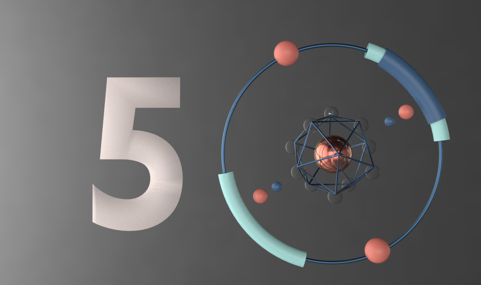
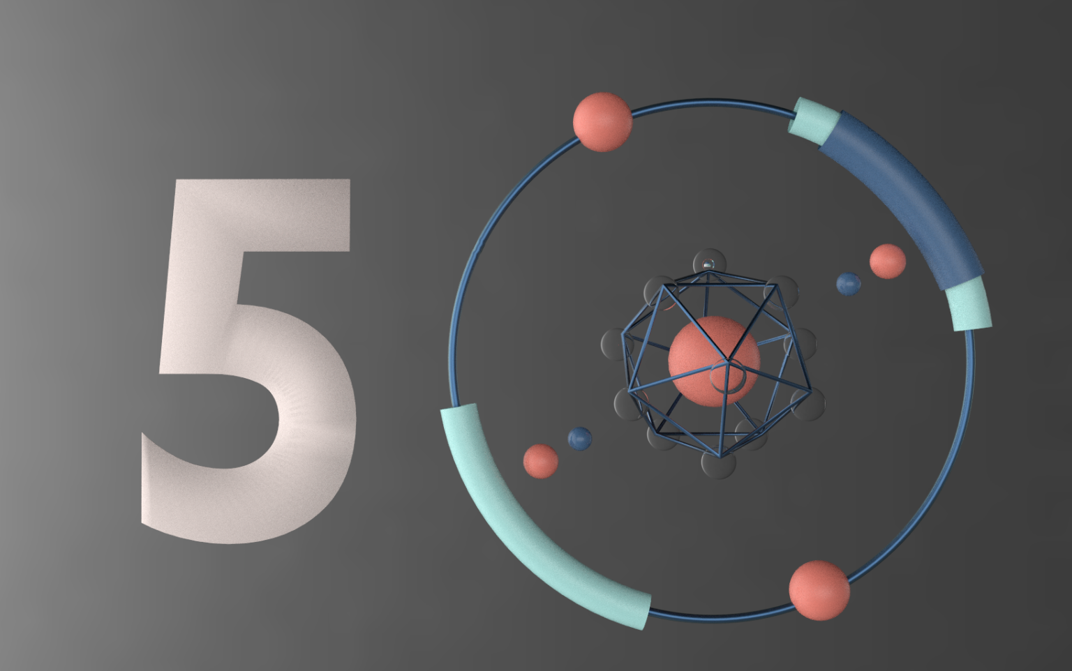
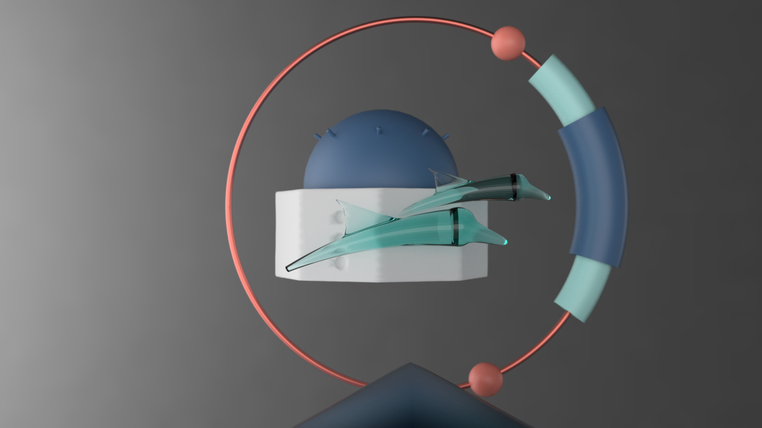
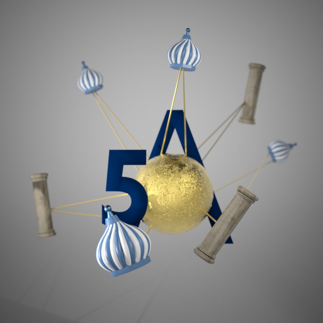
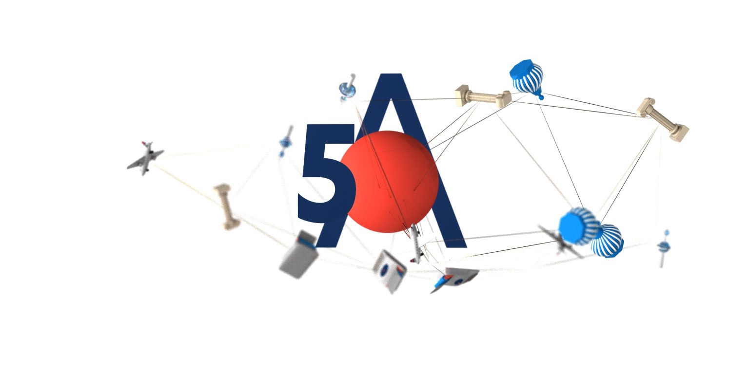
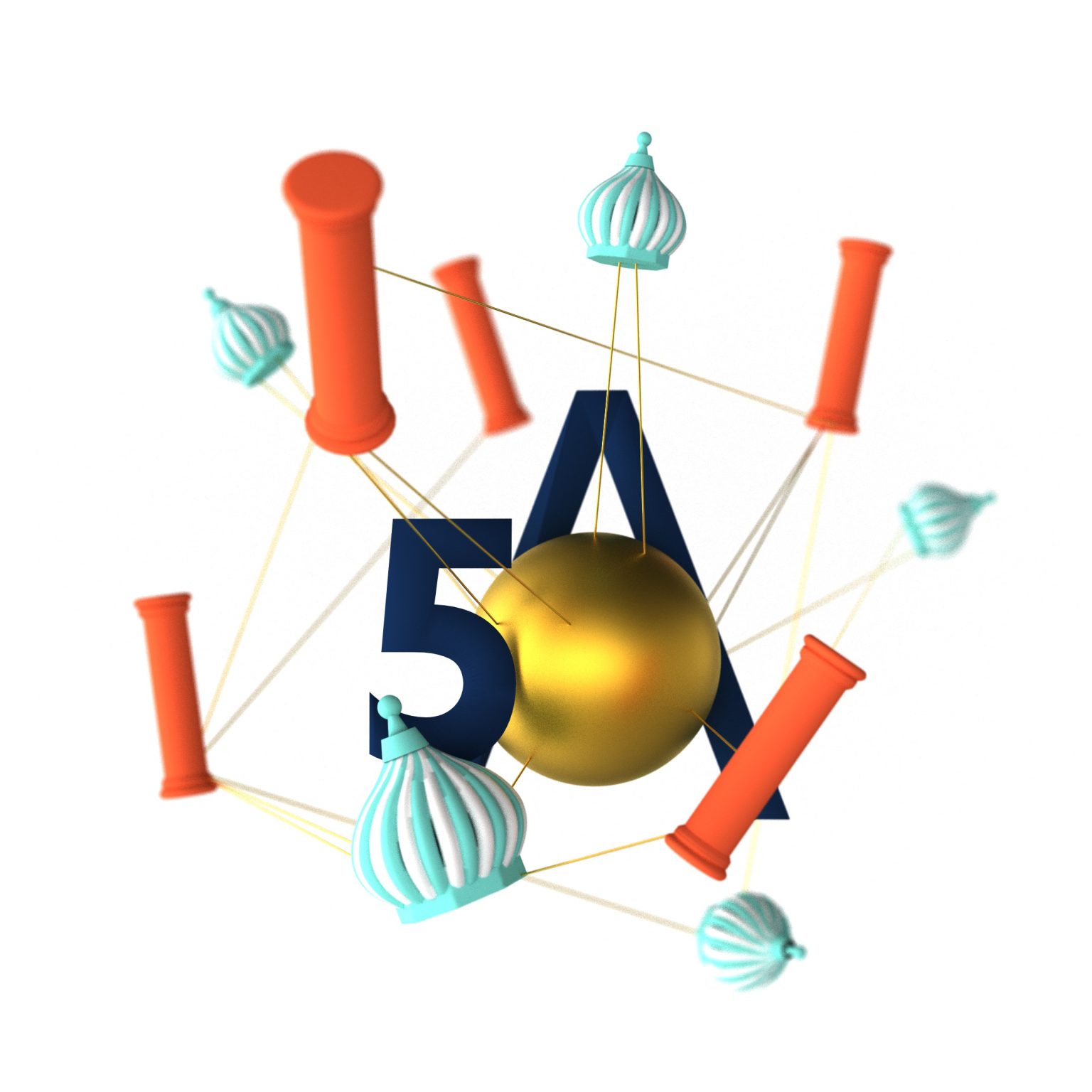
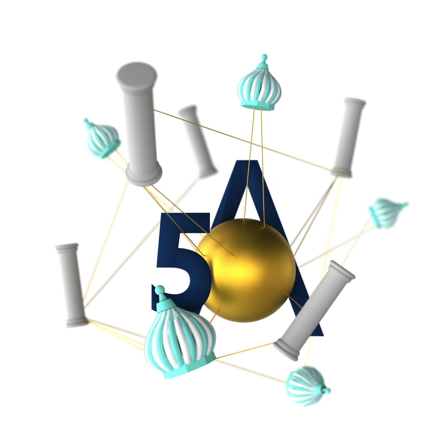
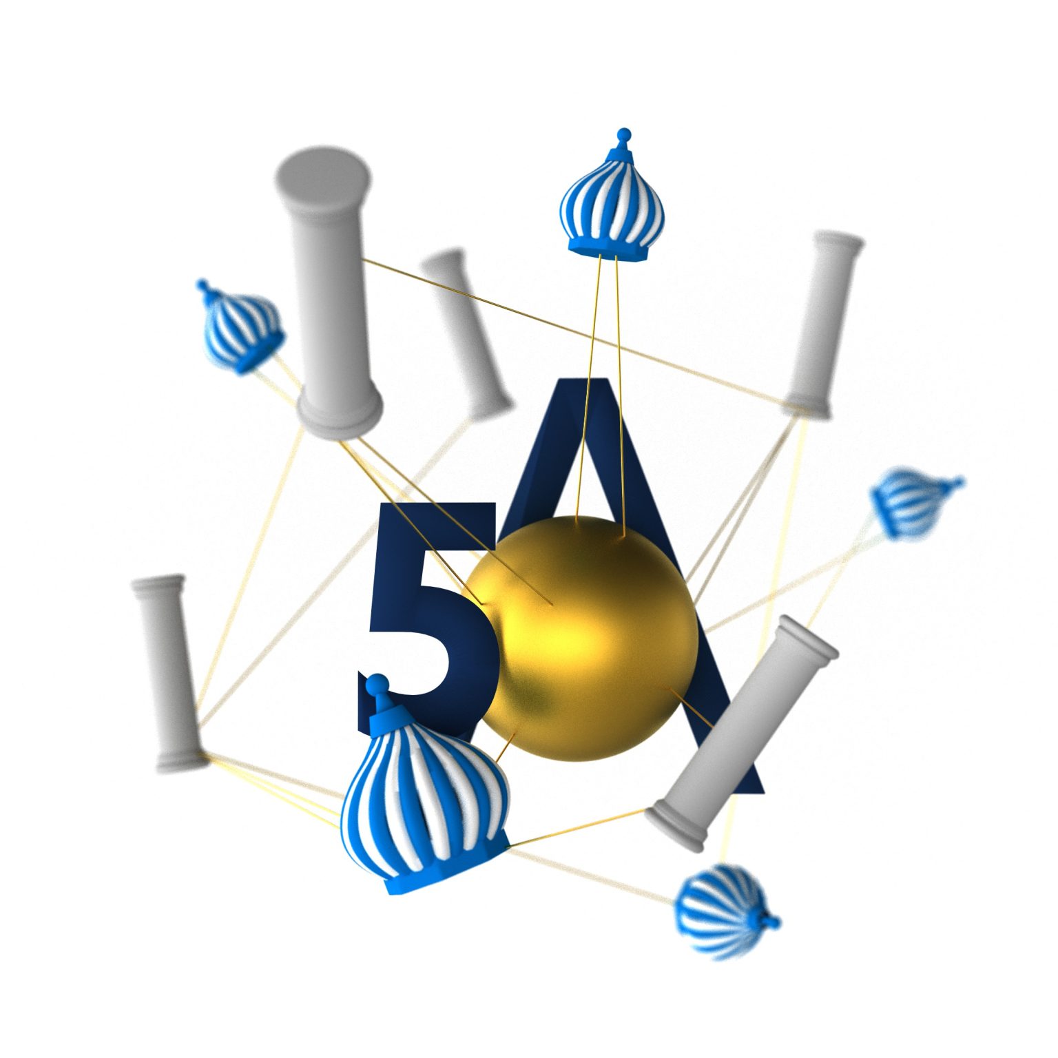
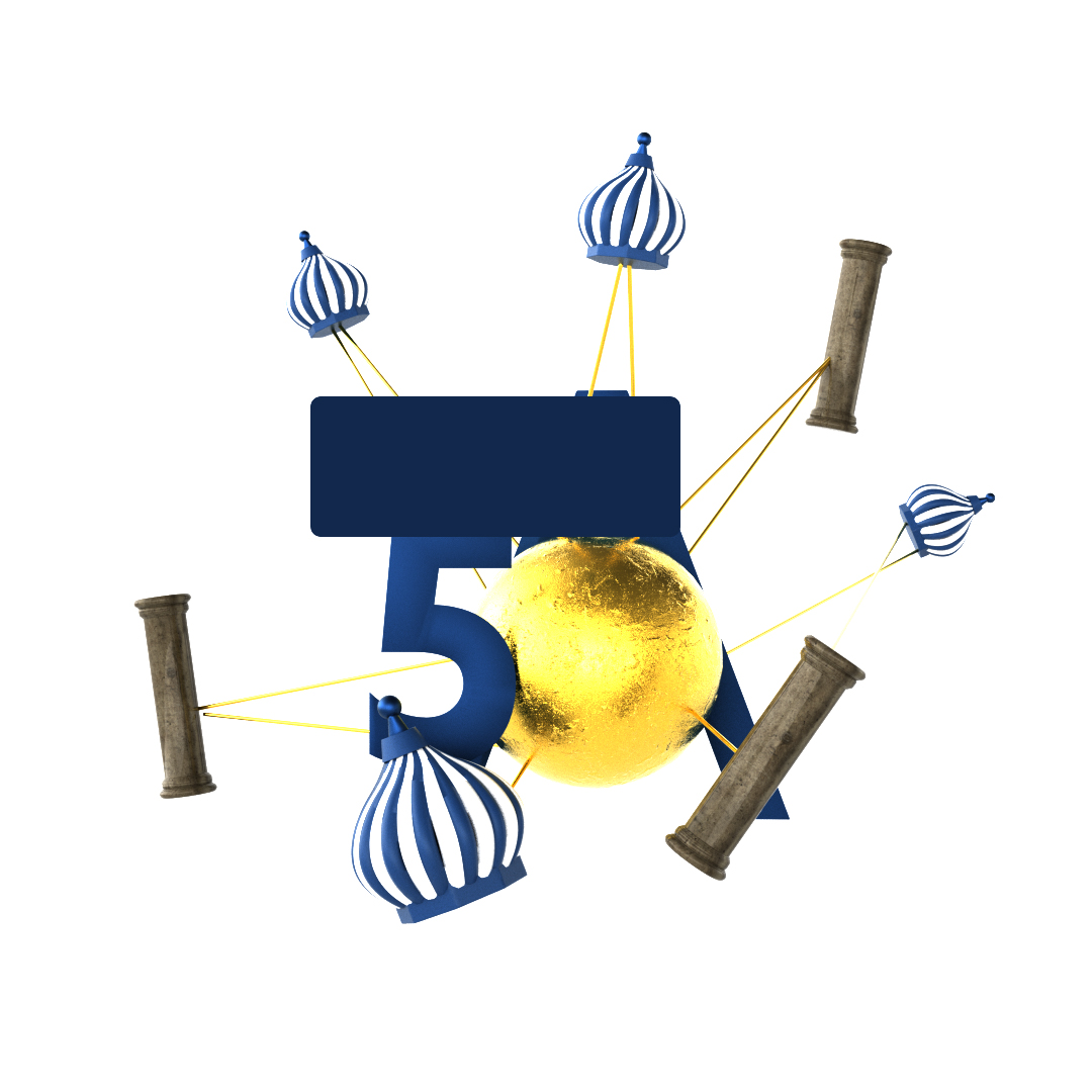
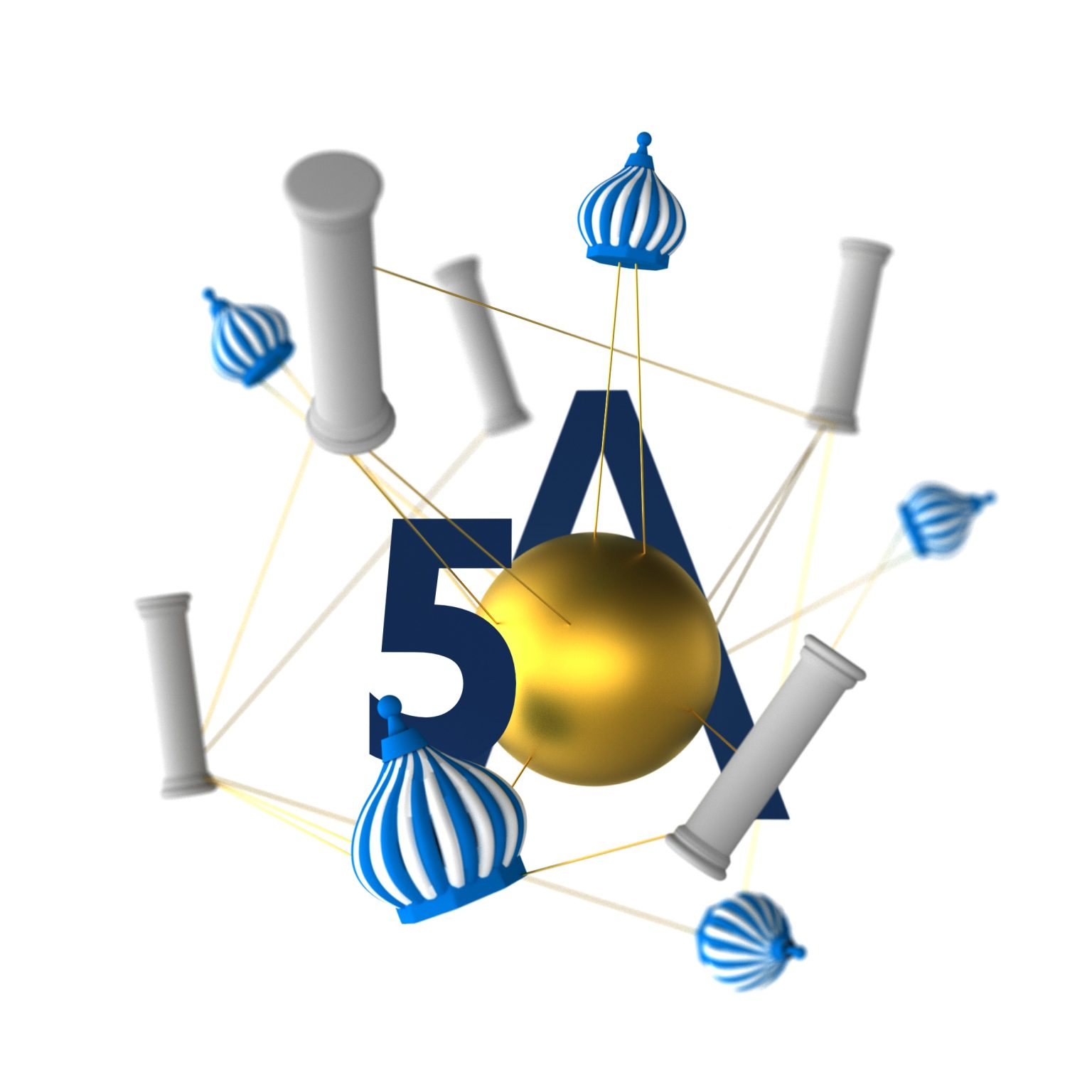
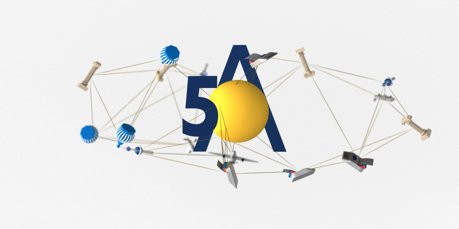
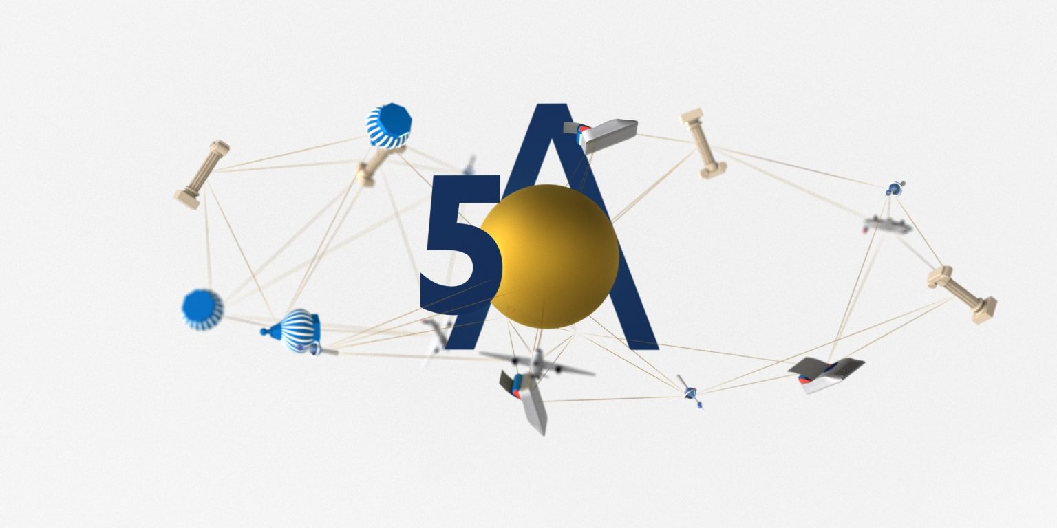
This 3D animated piece commemorates the 50th anniversary of a global company, showcasing its worldwide connections and achievements. The bold “50A” in the center is surrounded by communication and transport elements such as satellites, planes, and architectural icons, symbolizing the company’s global outreach. A gold sphere represents unity and innovation, while thin golden lines connect various objects, illustrating the company’s vast network and communication.
This project was created using Houdini, Cinema 4D, and After Effects to model, render, and edit the final composition. The visual design highlights both technical precision and creative storytelling, embodying the company’s legacy over five decades.
process.
Progress and Workflow
Conceptualization & Storyboarding
The project began with brainstorming sessions to align the visual narrative with the company’s 50th-anniversary theme. We developed storyboards and concept sketches to depict the idea of global communication and connectivity, emphasizing the company’s international presence and historical milestones.3D Modeling & Animation
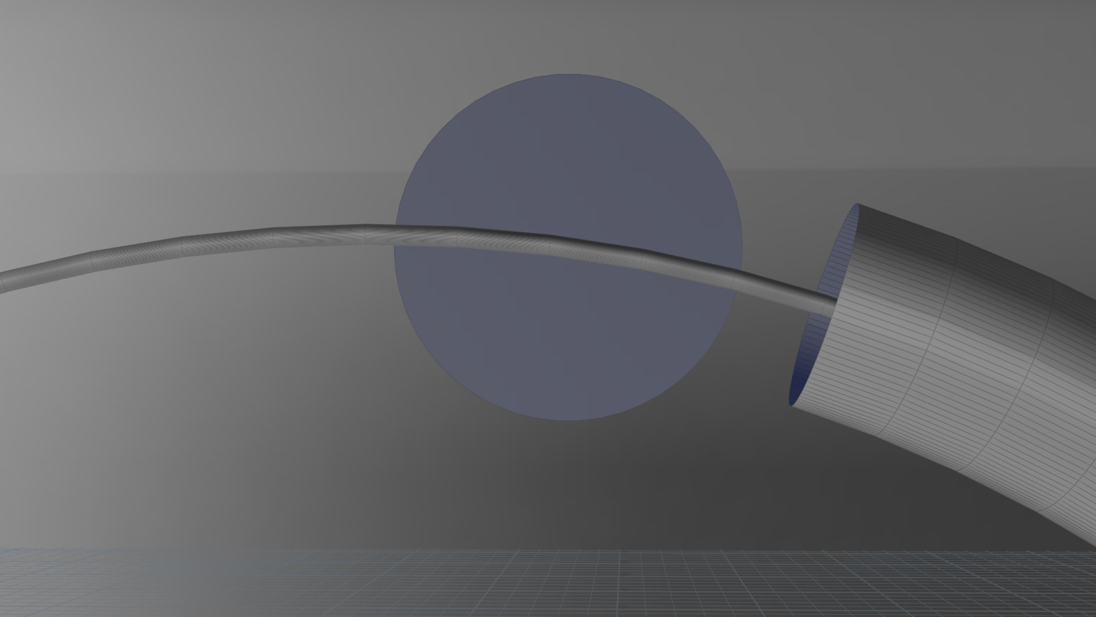
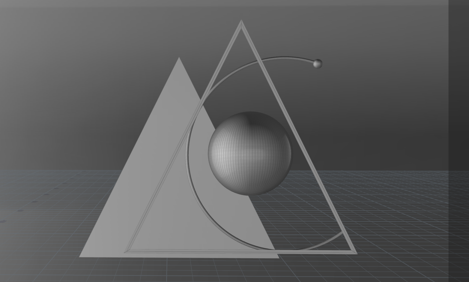
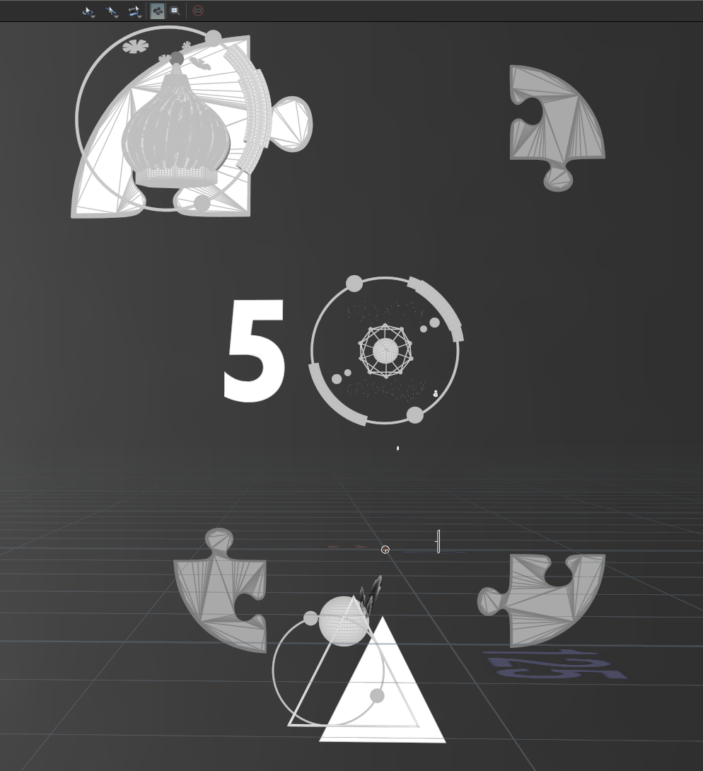
Using Cinema 4D, the core elements—including the globe, communication satellites, airplanes, and symbolic architecture—were carefully modeled. The “50A” centerpiece was designed to be bold yet minimalist, creating a strong focal point while maintaining a modern aesthetic. Animation was then added to simulate the movement of communication lines, signifying global data transfer and networks.Procedural Generation in Houdini
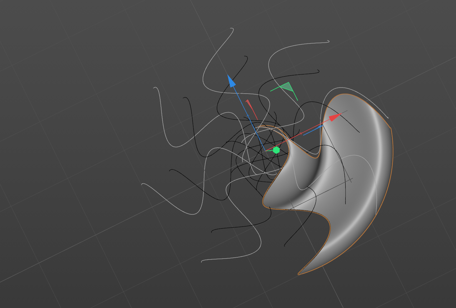
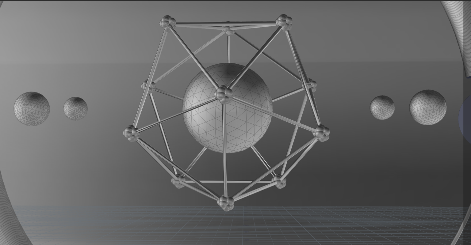
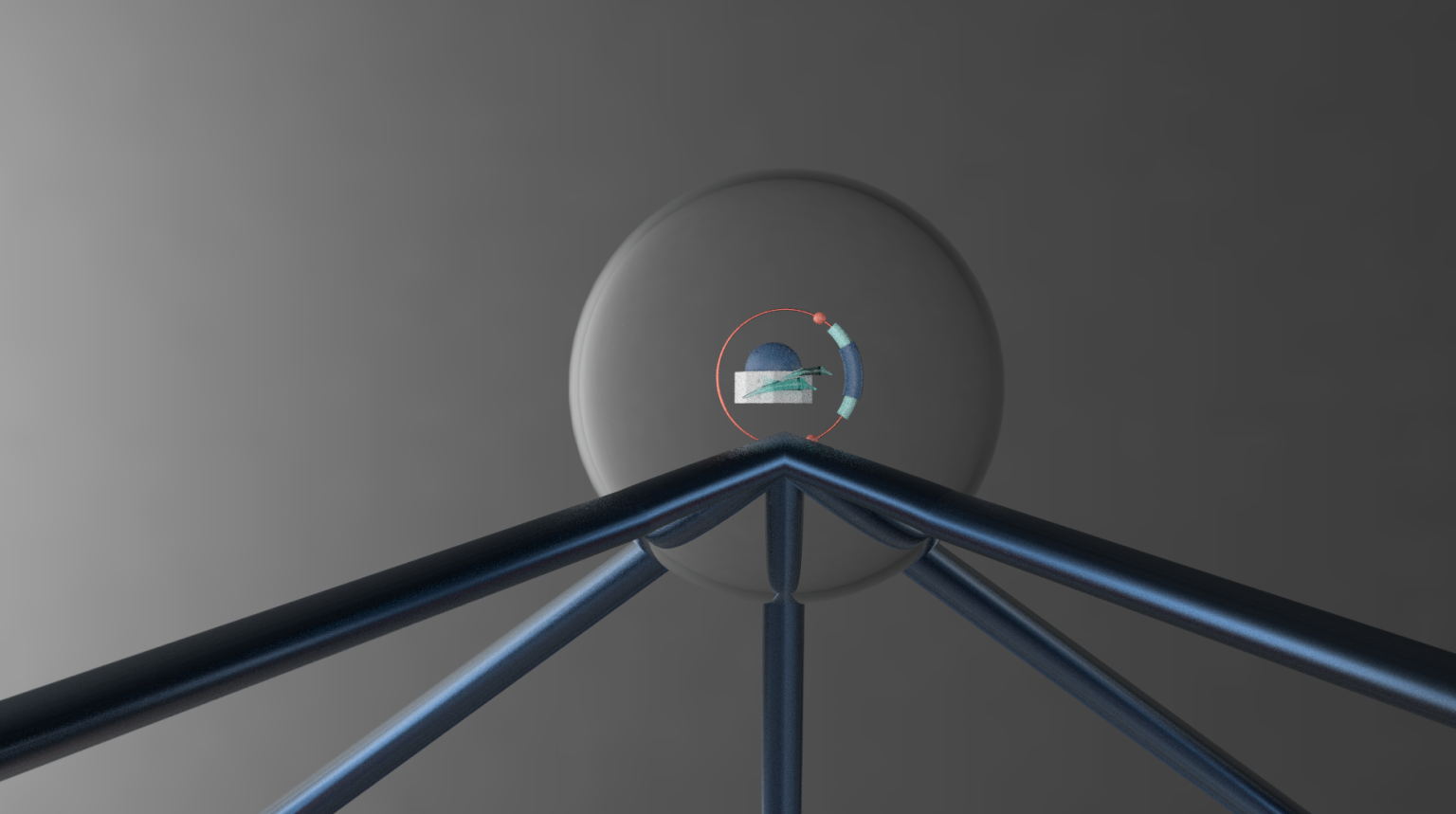
Houdini was leveraged for procedural generation of the complex wireframe network connecting the global assets. This allowed for efficient manipulation of numerous elements and ensured scalability for future iterations or changes.Texturing, Shading & Lighting
Texturing was key to conveying the sense of prestige and importance for the anniversary. The gold sphere and other metallic textures were created to evoke a sense of luxury and achievement, while subtle shading and lighting helped accentuate depth in the scene.Compositing & Visual Effects
After Effects was used to composite the rendered frames, where additional visual effects such as motion blur, glow effects, and color correction were applied to enhance the final look. The golden lines connecting various elements were made to pulsate slightly, reinforcing the idea of communication and flow.Rendering & Final Touches
Final rendering was completed in Redshift (or other render engines as applicable) to maintain high-quality visuals with optimized performance. The final output was carefully reviewed and fine-tuned, ensuring smooth animation transitions and an engaging visual presentation.
exploration.
During the early stages of the project, extensive exploration was conducted to discover the most effective ways to represent the company’s global presence and 50-year journey. This involved experimenting with various artistic and technical approaches:
Visual Metaphor Exploration
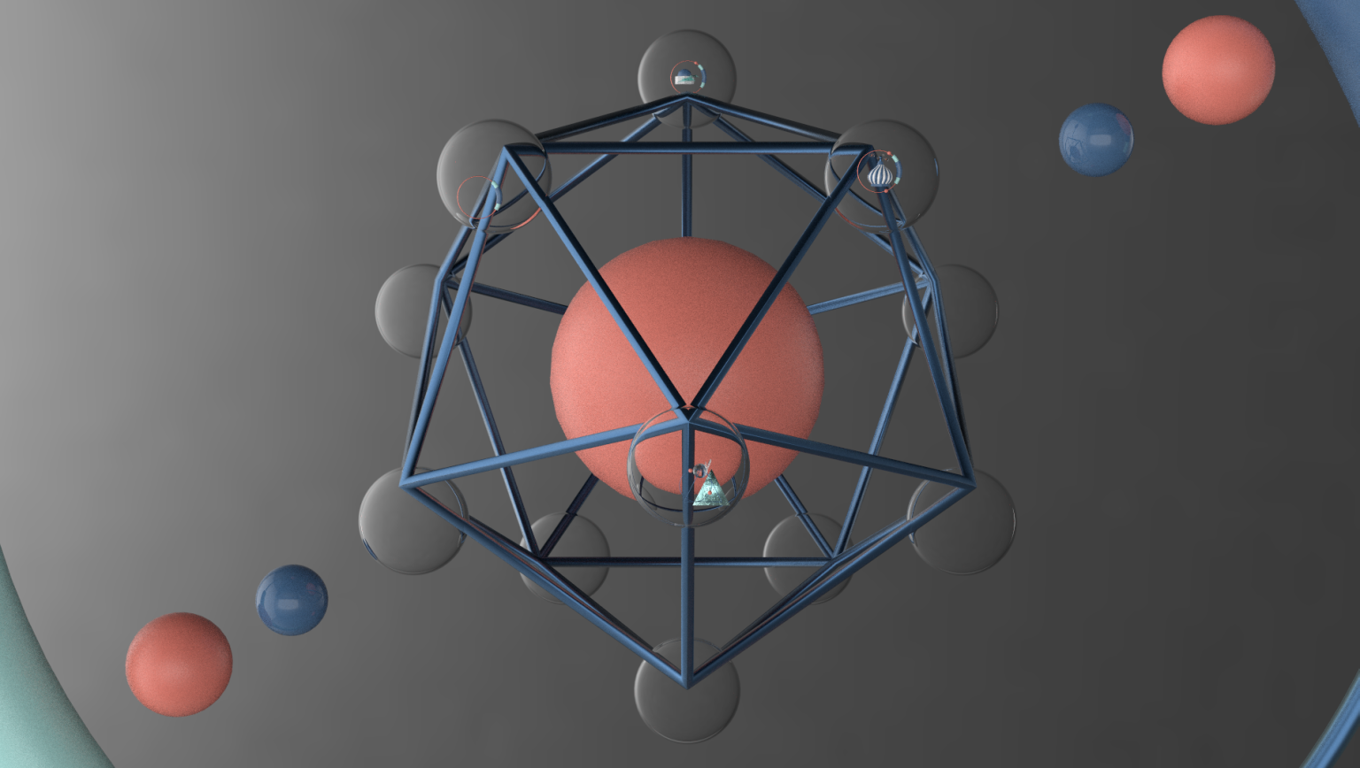
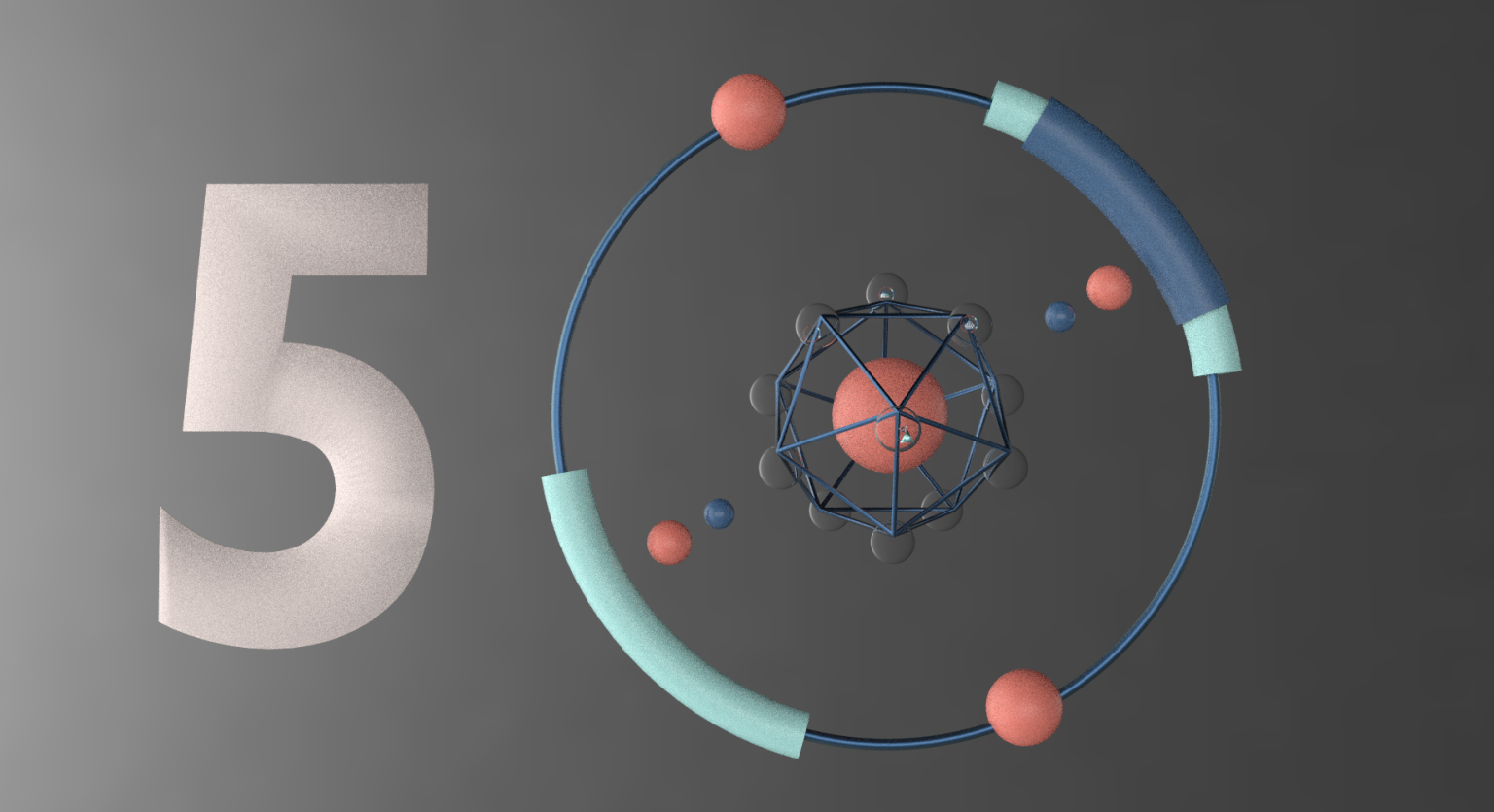
We explored multiple visual metaphors for the concept of “connection” and “communication,” such as mapping geographic locations, abstract wireframes, and global transportation networks. These visual motifs were tested for their symbolic alignment with the company’s values of innovation, growth, and global outreach.3D Design Techniques
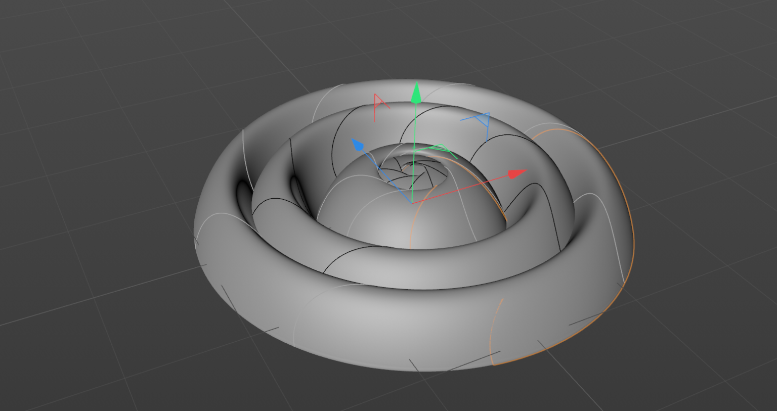
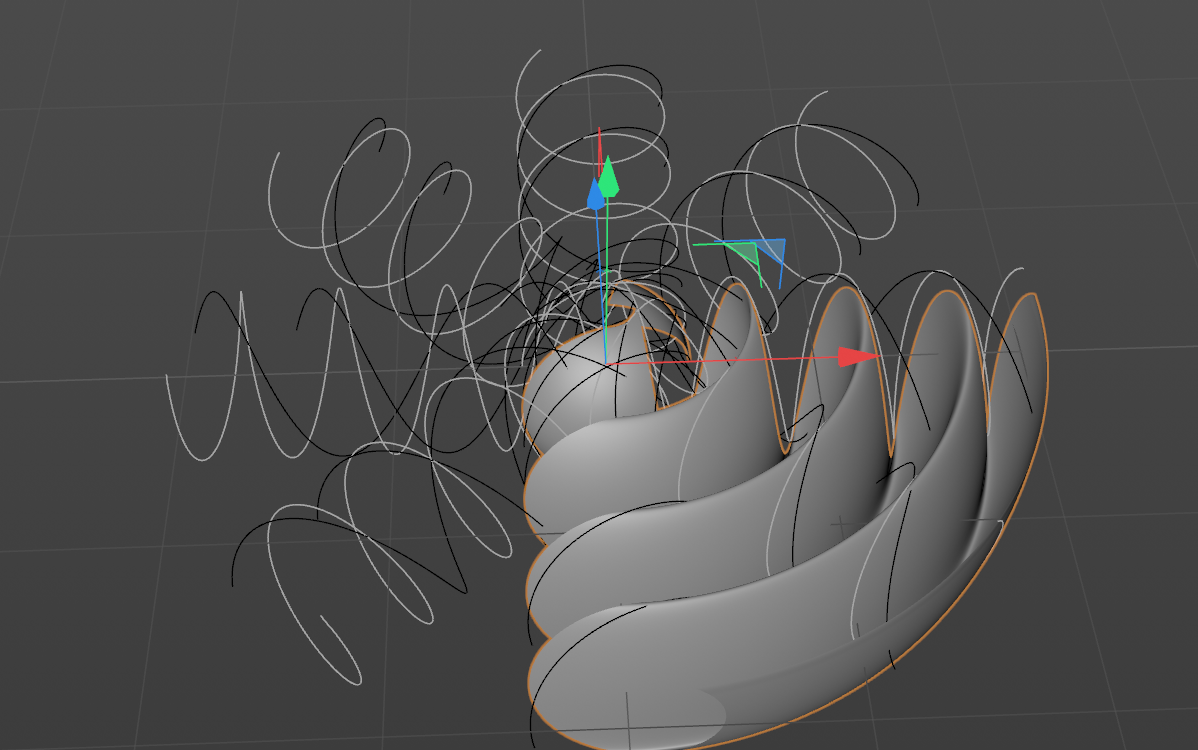
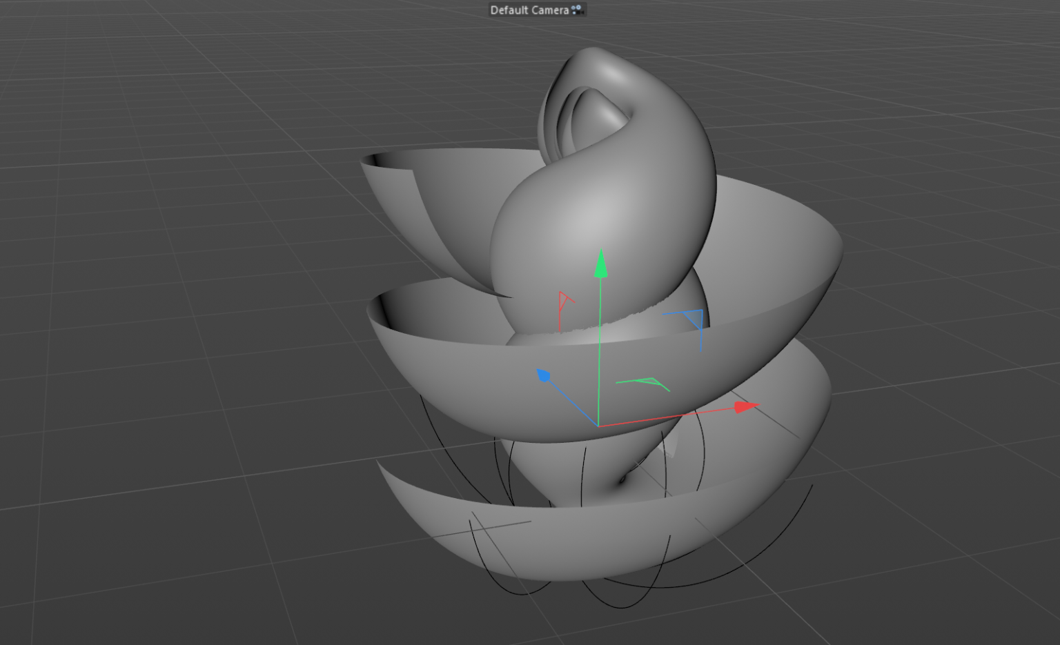
In Cinema 4D and Houdini, we experimented with different techniques for procedural generation of networks and objects. Various modeling approaches were tested, including parametric designs for architecture and communication icons, to determine the most aesthetically pleasing yet functional layout.Material & Lighting Tests
Textures such as metallic gold, reflective surfaces, and matte finishes were explored to evoke a sense of prestige while keeping the composition visually balanced. Lighting experiments focused on achieving the right blend of realism and stylization to draw attention to key elements like the “50A” and the surrounding icons.Motion Studies
Before committing to a specific animation style, we explored various motion dynamics. This included testing different animation speeds, camera movements, and transitions. The goal was to find a fluid yet dynamic motion that would enhance the message of connectivity without overwhelming the viewer.Wireframe and Connection Variants
In Houdini, multiple wireframe styles were tested, from intricate webs of connections to simpler, more direct paths. The exploration focused on creating a visual system that was not only technically sound but also aesthetically compelling, ensuring the network lines contributed to the overall storytelling.Color and Composition Trials
Several color schemes were trialed, from bold, high-contrast palettes to softer, more muted tones. The final color palette, with its rich gold accents and clean blue and white highlights, was selected after careful exploration of different combinations, ensuring the design aligned with the company’s branding.
